BBC elections
US Elections 2024
Designing a high-impact presidential election results banner for use across the BBC online.
Results banners are a fundamental feature of the online experience of a major election. They provide users with a consistent, at-a-glance snapshot of the current state of the election that is present across journeys through elections content.
Context
Tech updates meant the banner needed to be rebuilt (versus amendments to update previous banners), so this was used as an opportunity to widen the scope of the 2024 banner design project without limitations of customising and reusing a previously implemented results banner as was originally planned.
Design challenge
To be read at a glance, must be clear and easy to understand
Informative regardless of knowledge of electoral system and process
Visually engaging
Apply updated BBC elections branding
Goals
To provide users with…
A quick and clear overview of election results
An understanding of what the banner data actually means
A more engaging experience
Discovery & content strategy
User-Centric Research & Competitive Analysis
Analysed user research and learnings from recent elections
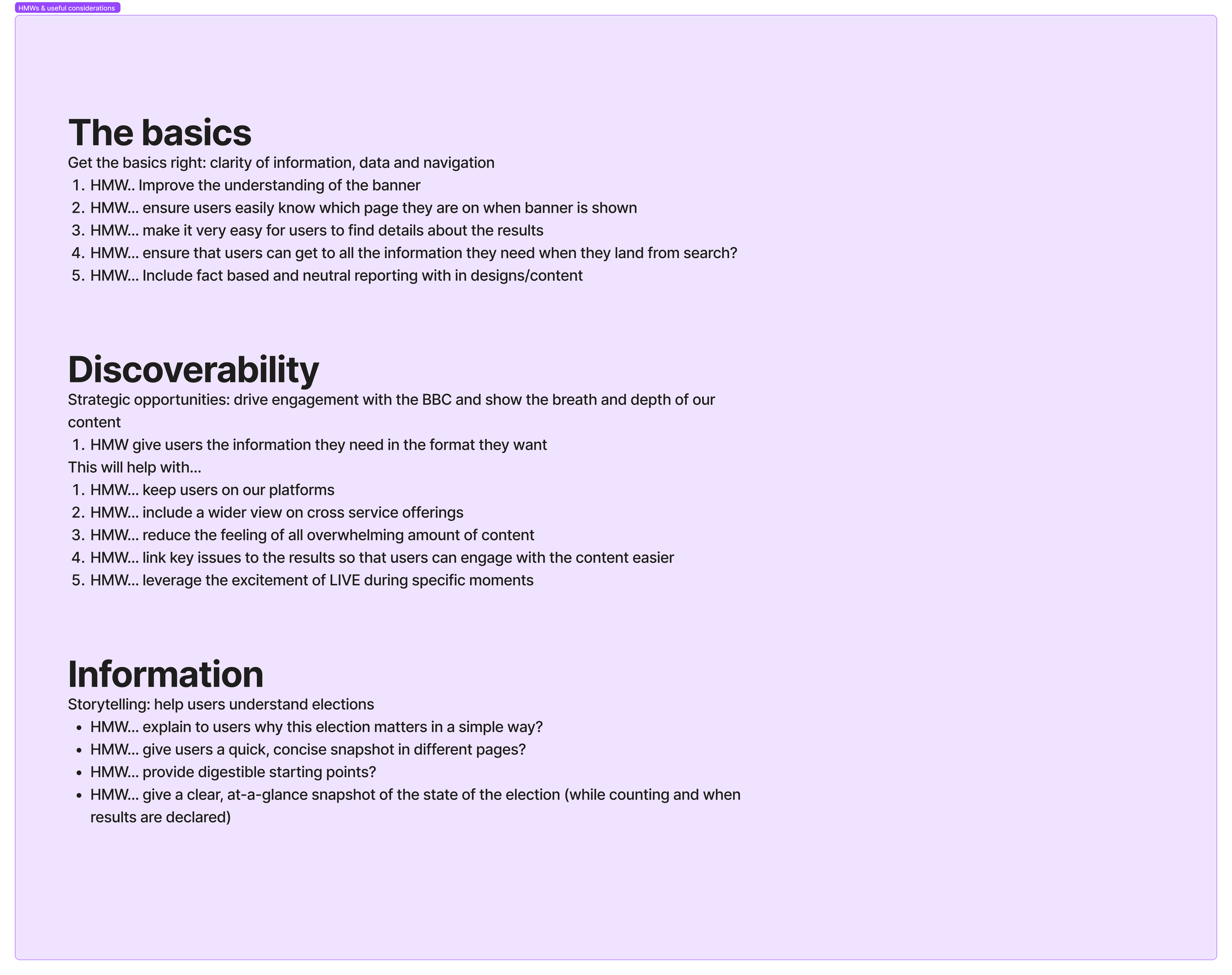
Grouped the data into three ‘pillars’ and generated “How might we...” prompts
Facilitated workshops with product managers, other UX designers and directors of UX to share themes and planned approach
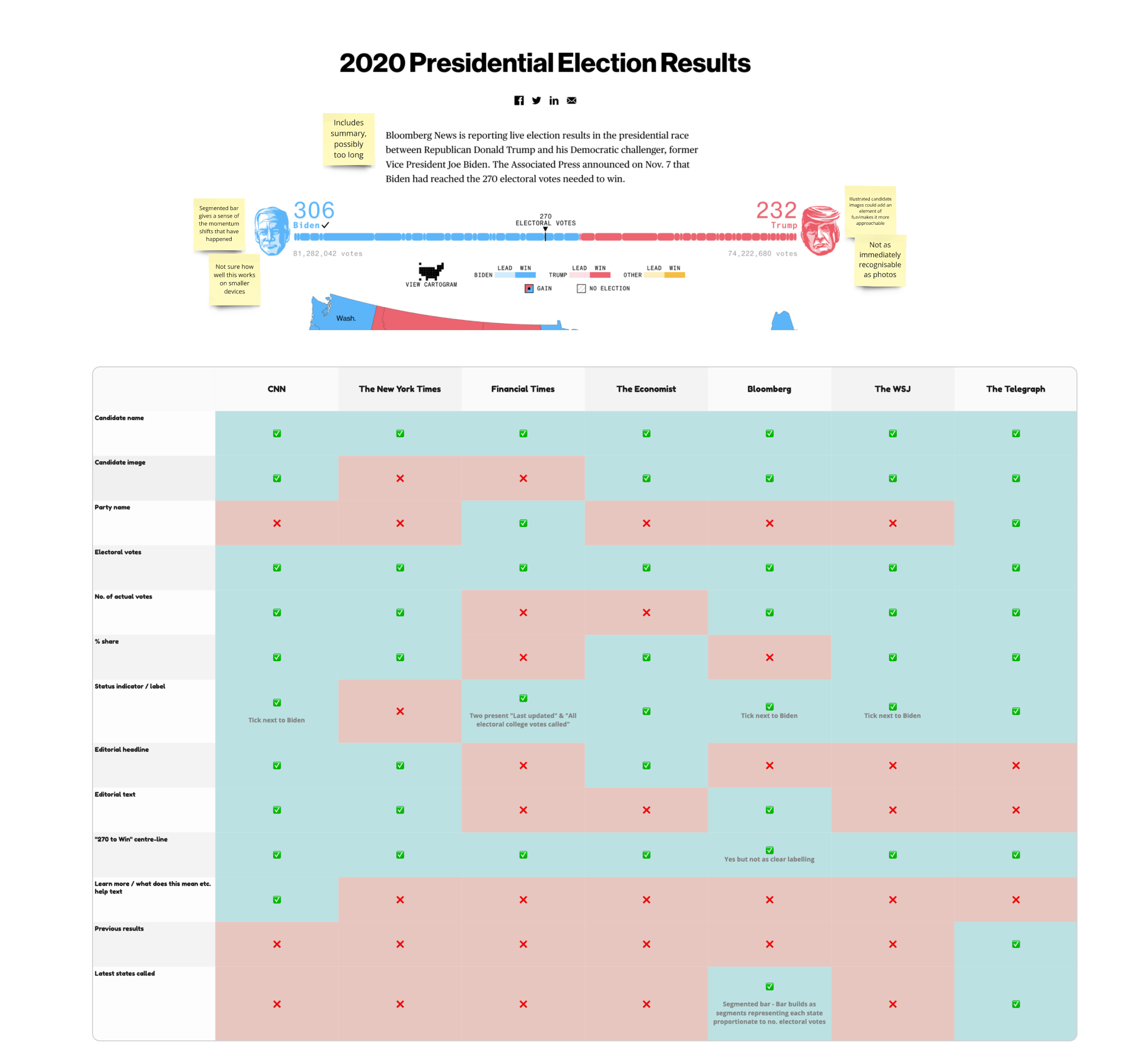
Conducted competitor analysis of results banners used by other online news providers
Existing BBC results banners
The banners for the 2020 US Presidential election, and 2022 midterms both use similar elements and formats to communicate the result and any developments. Being part the design team for the 2024 UK general election project just prior to starting US election design work provided starting points from the knowledge and learnings of that project.
Both successfully provide a quick snapshot of the result, however I knew from recent insights that the limited labelling of information shown, while lending the design simplicity, also assumes a level of knowledge and familiarity with the US electoral system and processes many users may lack.
Elections user research analysis
Taking advantage of user research conducted during previous US elections felt like an obvious starting point. I located a selection of qualitative and quantitative data, and used this as the subject of a workshop with our product managers, designers and creative director.
This dually helped achieve grouping data to identify themes, as well as acting as an effective kick off session to the design process.
The output from this workshop was sets of themes, grouped into three foundational pillars of usability; The basics, Discoverability and Information.
Pain points and areas of value
Overwhelming content
Users find election content and coverage overwhelming - due to a mix complicated electoral systems, terminology and omnipresence in the news cycle.
High engagement through visual content
Users gravitated to visual content and data visualisations for various reasons. Such as...
Visuals grab attention, a break from paragraphs of text that dominate news
Provides concise and digestible summaries entry points to understanding more detail
Graphs and charts are seen as pure fact not muddied by opinion
Navigation
Users use the banner as a helpful navigational tool but has also caused issues with navigation
Links in the banner are helpful when the news nav is hidden inside a menu
Banner size and position hides visual and informational cues such as titles and headings
Competitor analysis
In order to capture a mix of both objective and subjective data about competitor’s banners I approached the competitor analysis by facilitating a group design review of a selection of banners I had captured.
Feature audit helped identify features and information users may expect or aids understanding
A review of banner elements - what was well executed, or fell short
How was imagery, colour, and iconography used?
Are there established formats for presenting elections results banners, or their elements?
This exercise gave those involved a basis of shared knowledge and awareness used to define a set of product and design requirements. It also aided adding and refining the HMW statements in each pillar.
Ideation
Workshop with UX team
With a list of features created from the insights from user research and competitor analyses, I planned and facilitated an ideation workshop with other UX designers.
This was split into two sessions:
Explore alternative layouts
Prompt: Let’s explore other formats/layouts for a two-candidate results banner. Even if we decide on the current, meet-in-middle layout we may still learn something from this exploration that can be incorporated into our designBanner features
Prompt: Look at the list of banner elements and explore ways that they could work better or differently in our banner
After sharing the designs, myself and the rest of the UX team identified banner features, properties and elements to be explored in more detail.
This included
Adding visual interest, for example using a semi-cicular data vis or larger candidate imagery
Providing helpful details without cluttering the design e.g. using toggles or hideable elements
Communicating current progress - how long until there is a result?
Stress testing the designs
I began exploring the designs to take them further but to stress test with more realistic constraints and considerations like the BBC design system and device sizes.
Sports data can be a useful source of inspiration, when abstracted the data points share close similarities.
Utilising imagery created by the News design team for editorial content leading up to the election to test bold visuals and try layouts across device types.
Leveraging existing components was also explored but for various reasons the dev team suggested it may actually be more time consuming to customise an existing component.
TV broadcast alignment
Banners are also used on TV broadcasts during the election. TV have different requirements and challenges to online, and have the help of a presenter to provide extra context and explainations but we worked together from the start of the project to align on key elements, language and visual presentation so that the banner remained a consistent touchpoint for users across devices and platforms.
User research
Defining the level of detail in the banner. To better meet audience needs, a better understanding of the necessary level of detail and format of information shown was required.
Are any commonly used banner elements not fully or correctly understood?
How quickly or easily can users digest what is shown?
User testing approach:
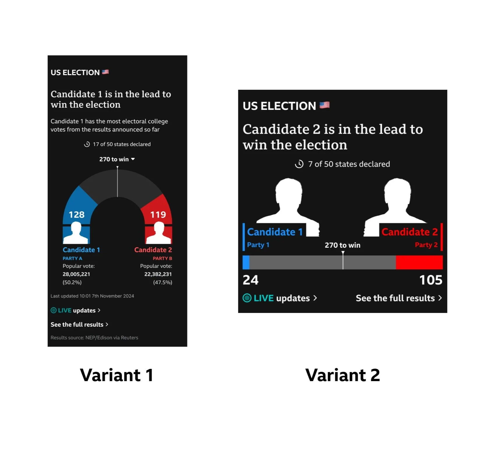
I felt a good way to understand what to show was to test two variations;
High detail: Including both vote types, share, labelling of numerical data, additional editorial copy, timestamps
Limited detail: Only electoral votes, headline only editorial copy, no collapsible sections
Two variants showing either high or low levels of information were shown to different sets of users. They were presented with a set of screens taking them through the different stages of the election.
While the main purpose was to get a clearer direction tward ensuring the level of information was not overwhelming, it was hoped that the test would reveal some insight into aesthetic choices that might engage users and navigational features such as the link to the live coverage.
Light mode variants were also shown to gain an understanding of preferences between light and dark presentations.
Testing feedback
Terminology - users showed an understanding of types of votes displayed, though unlabelled data was referred to using a variety of terms
Labels do not necessarily help a user gain a quick snapshot of the current state of the election, BUT explanation likely benefits users who want to look at election news or results in more detail
Users felt both banners showed all the information needed, but was commented during a high-detail test that “the simpler the better” is a good aim for the banner
Visually, a darker background was preferred by 67% (semi-circular design) and 40% (horizontal design) of users
Sharing work-in-progress to gather feedback from other designers helped me get the balance of visual and informational impact. I wanted to get opinions on when was I risking the photography and graphic design elements pulling attention away from the data. I also seeked out reviews from the content design team to ensure language and text formatting wouldn’t create unneccesary barriers to user comprehension.
The result of these discussions were a number of smaller tweaks that resulted in a layout that would guide users to an easier understanding through an improved information hierarchy, less visual information to interpret (i.e. brackets, icons, borders) and optimised copy (less jargon, sentence case instead of title case or all caps, use of full candidate names).
Build
There were challenges with creating a responsive design using the cut-out styling of candidate imagery. The main concerns were keeping the balance of imagery to data and avoiding awkward crops that hide too much of the candidate’s face or has them floating in space. By talking through solutions and closely supporting by pairing with devs during the build of the banner ensured it behaved correctly across different sizes.
OUTCOME
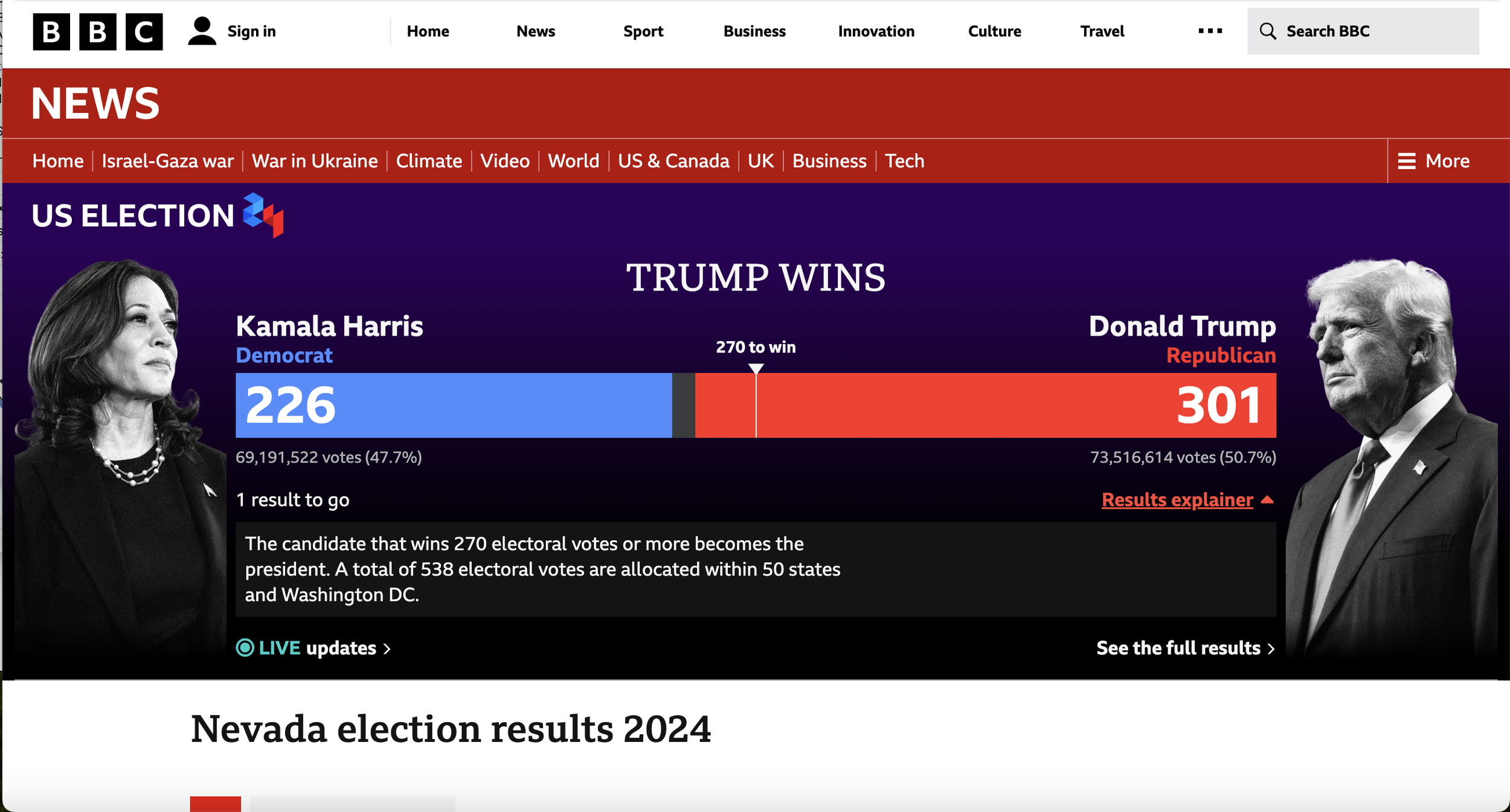
The banner above shows the banner in its final state, the overall result and all states declared.
During the election the banner was shown across many types of pages including the News and BBC homepages, individual states’ results pages and many articles relating to the election. In these cases where the banner was shown outside national results page an additional link is provided to allow easy navigation back to the national picture. The live link offered constant access to live reporting for those users seeking extra detail and context.
The expandable results explainer gave a concise summary of the electoral college votes system. This helped contextualise information to the section of users where the labels (e.g. “270 to win”, “69,191,522 votes”) were not quite descriptive enough, while keeping the default state of the banner from being overloaded with information.
The editorial headline “TRUMP WINS” provided a setting of context to lend clarity and immediacy. This element was controlled and edited by the editorial team and the guideline to use sentence case only was not followed but since it was such a short phrase it was not enough of a concern to dedicate time to amend during such a busy news period.


